Position a CSS background like a block element
Percentages in the CSS background-position values “refer to the size of the background positioning area minus size of background image” (source). Chris Coyier illustrated it wonderfully on css-tricks.com and as he said, it’s a really clever and intuitive way of doing it.
Sometimes though, you may want to position the background as though it was an element with position:absolute. It’s trivial if the element has a fixed dimension. You just use pixels instead of percentages. But there’s a small arithmetic problem to solve if your layout is fluid.
I had to figure out that problem recently in a project which involved elements with a gradient progress bar as a background in a variable-width design. I didn’t want to just scale the background because I wanted to preserve the aspect of the gradient.
Example
Consider the following:
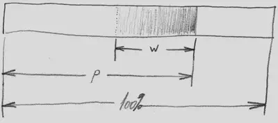
…where:
100% is the width of the element,
w is the relative width of the progress bar’s gradient (30% in this example),
p is the percentage of progress so far(75% in this example).
You want to position the gradient 1 - p from the right. At right 100% (p = 0%) you end up with the left end of the gradient aligned with the left border of the element.
Formula
Now since the percentage position is calculated in relation to 1 - w, you just need to bring that value back to 1 with a multiplicative inverse and calculate p´ = (1 ÷ (1 - w)) × p
For example, if the progress is 75% and you want to position the right edge of the gradient at exactly 25% of the right border, the background-position will be:(1 ÷ (1 - w)) × (1 - p)(1 ÷ (1 - 0.3)) × (1 - 0.75)(1 ÷ 0.7) × 0.251.43 × 0.250.36 or 36%
Warning
Because of the way background image percentage positions are multiplied by 1 - w, the multiplier is zero when the background is stretched to 100% of the width of the element. This is one of the reasons my gradient is scaled down to 30% with background-size: 30%.
For Django templates
Here is a Django filter that will convert a progress percentage into the required right-positioning percentage. It take one argument, the relative width of the background as a floating point number.
from django import template

register = template.Library()

@register.filter
def relative_bg_pos(value, arg):
    """Calculates the % offset of the background like an absolutely positioned
    block rather than the way browsers calculate the background-position.

    See also:
    https://css-tricks.com/i-like-how-percentage-background-position-works/
    """
    from_right = 1 - value
    bg_width = float(arg)
    size_ratio = 1 / (1 - bg_width);
    return "{:.2%}".format(size_ratio * from_right)</pre>
Use it in a template like so. Suppose that the context variable p contains the progress as a floating point value between 0 and 1. Notice how the background-size is 30% and I passed 0.3 as a parameter to the relative_bg_pos filter.
<style>
.progressbar {
    <span class="comment">/* Permalink - use to edit and share this gradient: http://colorzilla.com/gradient-editor/#565889+0,565889+100&0+0,0.24+100 */</span>
    background: -moz-linear-gradient(left, rgba(86,88,137,0) 0%, rgba(86,88,137,0.24) 100%); <span class="comment">/* FF3.6+ */</span>
    background: -webkit-gradient(linear, left top, right top, color-stop(0%,rgba(86,88,137,0)), color-stop(100%,rgba(86,88,137,0.24))); <span class="comment">/* Chrome,Safari4+ */</span>
    background: -webkit-linear-gradient(left, rgba(86,88,137,0) 0%,rgba(86,88,137,0.24) 100%); <span class="comment">/* Chrome10+,Safari5.1+ */</span>
    background: -o-linear-gradient(left, rgba(86,88,137,0) 0%,rgba(86,88,137,0.24) 100%); <span class="comment">/* Opera 11.10+ */</span>
    background: -ms-linear-gradient(left, rgba(86,88,137,0) 0%,rgba(86,88,137,0.24) 100%); <span class="comment">/* IE10+ */</span>
    background: linear-gradient(to right, rgba(86,88,137,0) 0%,rgba(86,88,137,0.24) 100%); <span class="comment">/* W3C */</span>
    filter: progid:DXImageTransform.Microsoft.gradient( startColorstr='#00565889', endColorstr='#3d565889',GradientType=1 ); <span class="comment">/* IE6-9 */</span>
    background-size: <span class="fg_yellow">30%</span>;
    background-repeat: no-repeat;
}
</style>

<div class="progressbar" data-progress="{{ p }}" style="background-position:right {{ p|relative_bg_pos:"<span class="fg_yellow">.3</span>" }} top"></div></pre>
Alexandre de Verteuil
Senior Solutions Architect
I teach people how to see the matrix metrics.
Monkeys and sunsets make me happy.